Expert Interior Color Combinations and the 60-30-10 Rule for Home Makeovers
· GlobeWire Daily Lifestyle Desk · Source: navbharattimes.indiatimes.com
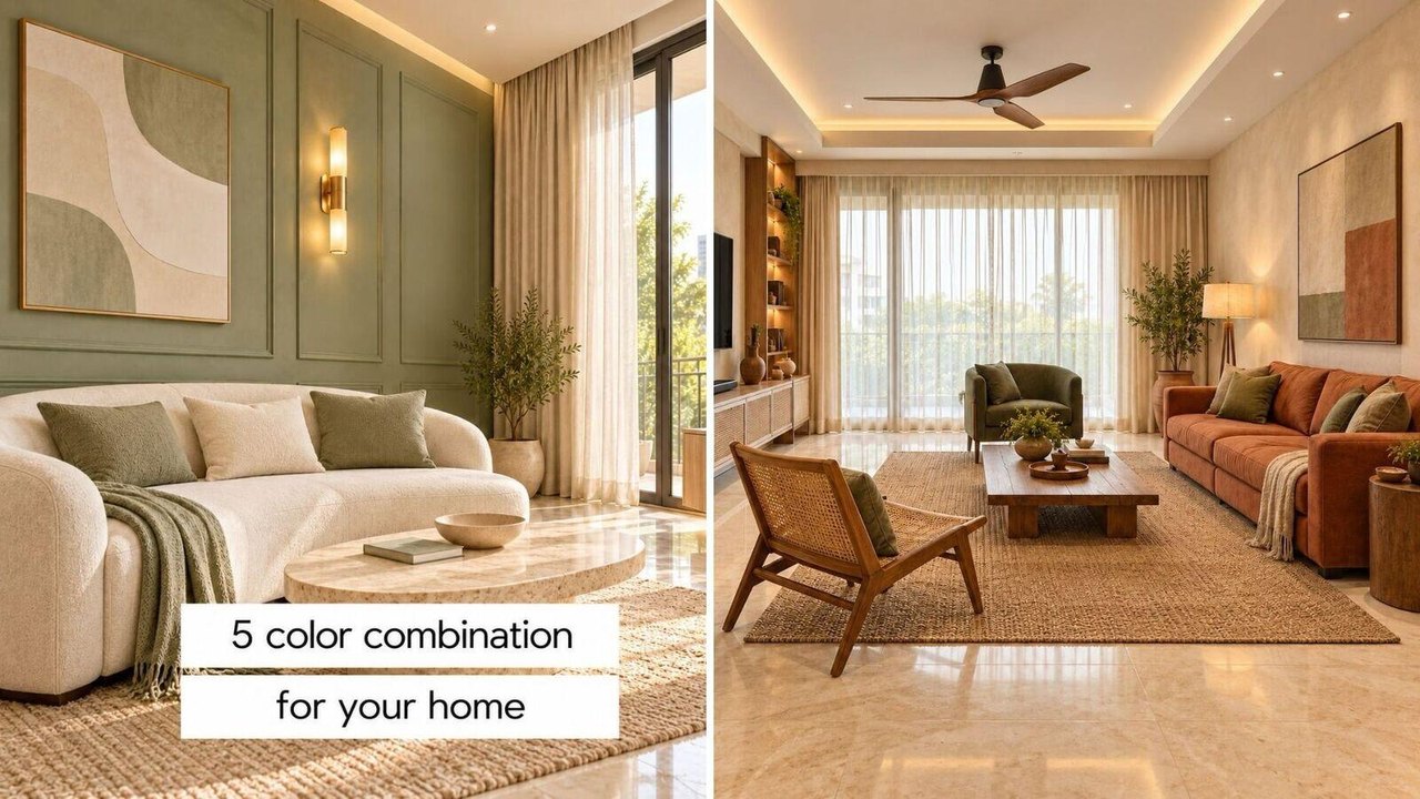
Image: Navbharat Times · Photo source · Resized and letterboxed to 16:9; no AI generation
Choosing the right color palette is essential when building a new home or refreshing interior spaces. According to reported lifestyle guidance, interior experts often recommend the 60-30-10 rule to maintain visual balance and appeal in home decor.
Reported color schemes and styling approaches include:
- Modern and Minimal: Features 60% white, 30% gray, and 10% black. Typically uses white walls, light gray stone floors, ash wood elements, textured gray soft furnishings, and matte black hardware contrasts.
- Royal and Calm (Cream and Teal): Combines 60% cream, 30% teal, and 10% brass accents. Incorporates marble flooring, cream walls, teal velvet seating, linen fabrics, ivory carpets, and brass lighting.
- Earthy and Warm (Beige and Terracotta): Relies on 60% beige, 30% terracotta, and 10% olive. Involves beige stone, linen curtains, jute rugs, cane textures, terracotta upholstery, and olive green accents.
- Traditional Indian Theme: Implements 60% neutral tones, 30% deep maroon/moon, and 10% antique gold. Uses neutral walls, block-printed curtains, traditional carpets, maroon seating, carved wooden partitions, and antique brass lamps.
- Natural Pastel: Balances 60% off-white, 30% sage green, and 10% tan. Combines off-white walls, light wood flooring, sage green linen, tan leather accent chairs, and cane storage.
Understanding the 60-30-10 Rule
Design discussions frequently outline this ratio to prevent color overload:
- 60% Primary Color: Neutral or light shades (like white, cream, or beige) used on walls, flooring, and large curtains to make rooms appear open and airy.
- 30% Secondary Color: Main hues (such as teal, sage, terracotta, or maroon) chosen for sofas, seating arrangements, carpets, or large furniture.
- 10% Accent Color: Metallic or darker finishes (like brass, gold, matte black, or olive) applied to lighting fixtures, hardware handles, cushions, or small decorative items.
Readers can verify color palettes by consulting certified interior designers, reviewing material samples in natural lighting before purchasing paint, and cross-referencing design methodologies through professional architecture and interior publications.
AI-assisted reporting; source claims are attributed and have not been independently verified.
More to read
 Understanding Childhood Trauma and Festive Anxiety: Expert Advice on PTSD and Coping Strategies
 Smart Ways to Manage and Plan Your Diwali Bonus: Expert Financial Tips
 Tiny Melbourne Basement Apartment Wins National Architecture Interior Prize
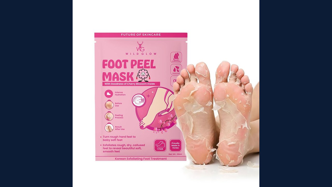 WildGlow Cherry Blossom Korean Foot Hydration Mask: A Home Pedicure Solution
Trending on GlobeWire Daily
Selected from recent coverage and related topics; not live search rankings.
 Madhya Pradesh Government Plans Revenue Generation from 117-Year-Old Edward Villa in Mumbai Through Leasing
 iPhone 18 Pro Named TechRadar Product of the Year 2026
 Google Project Suncatcher Runs Gemma 4 AI on Orbiting Satellite and Receives First Response
 Gender Disparities in Eye Care Access Across India Examined
 Satellite Images Show Cyclone Arnab Weakening Over India As New System Brews
 Expanding Green and Blue Spaces Crucial for India's Economic and Public Health, Reports Indicate